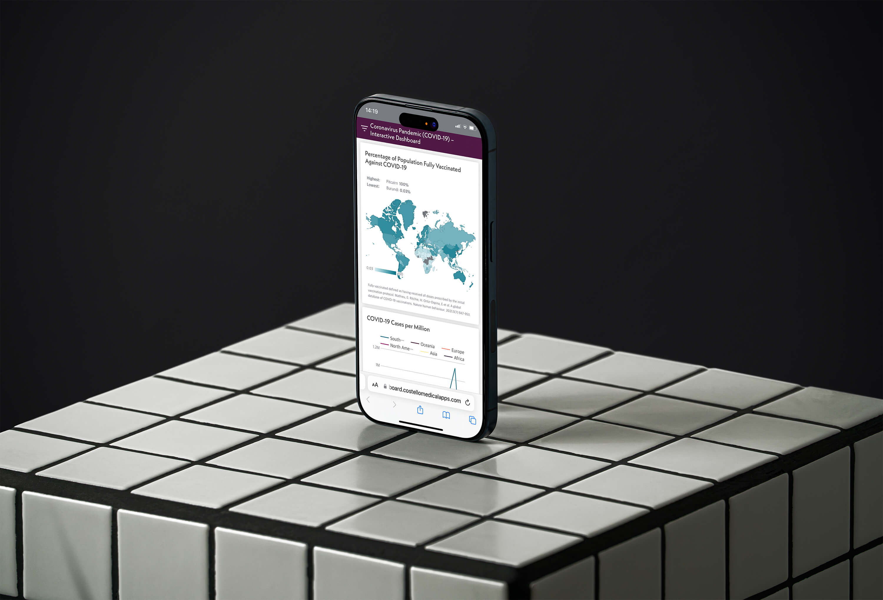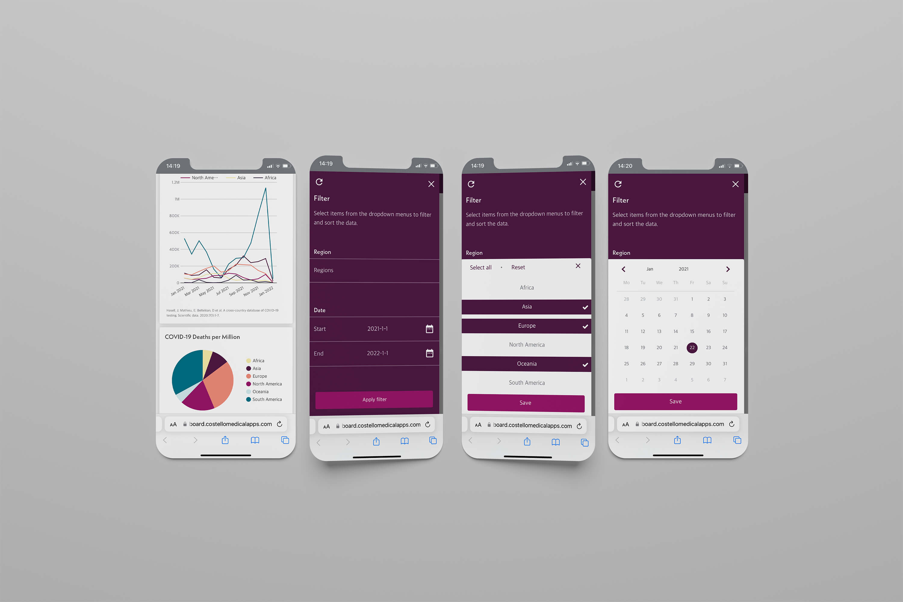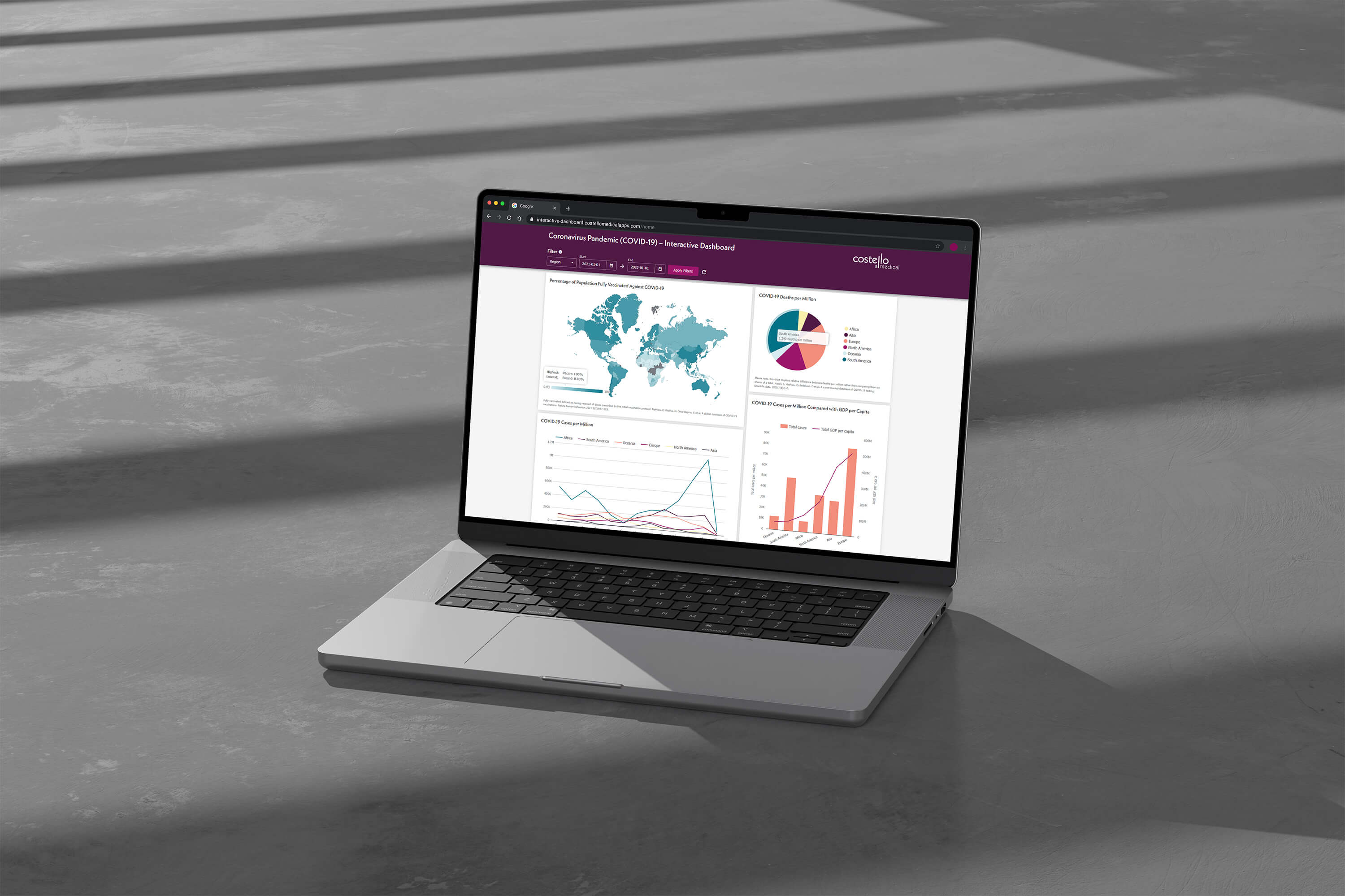
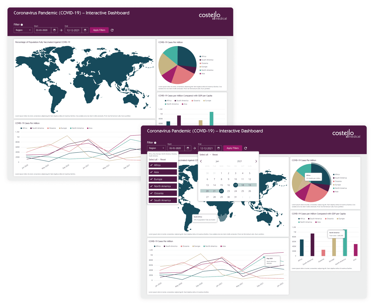
This project aims to design an interactive dashboard to showcase Costello Medical’s digital services. The dashboard will serve as a data visualisation platform, enabling users to explore key metrics and filter data.
Team structure
1x developer, 1x digital designer (me)
Research method
Moodboard
Discipline
Web design, data visualisation
Platform
Website, mobile, desktop
Duration
2 weeks
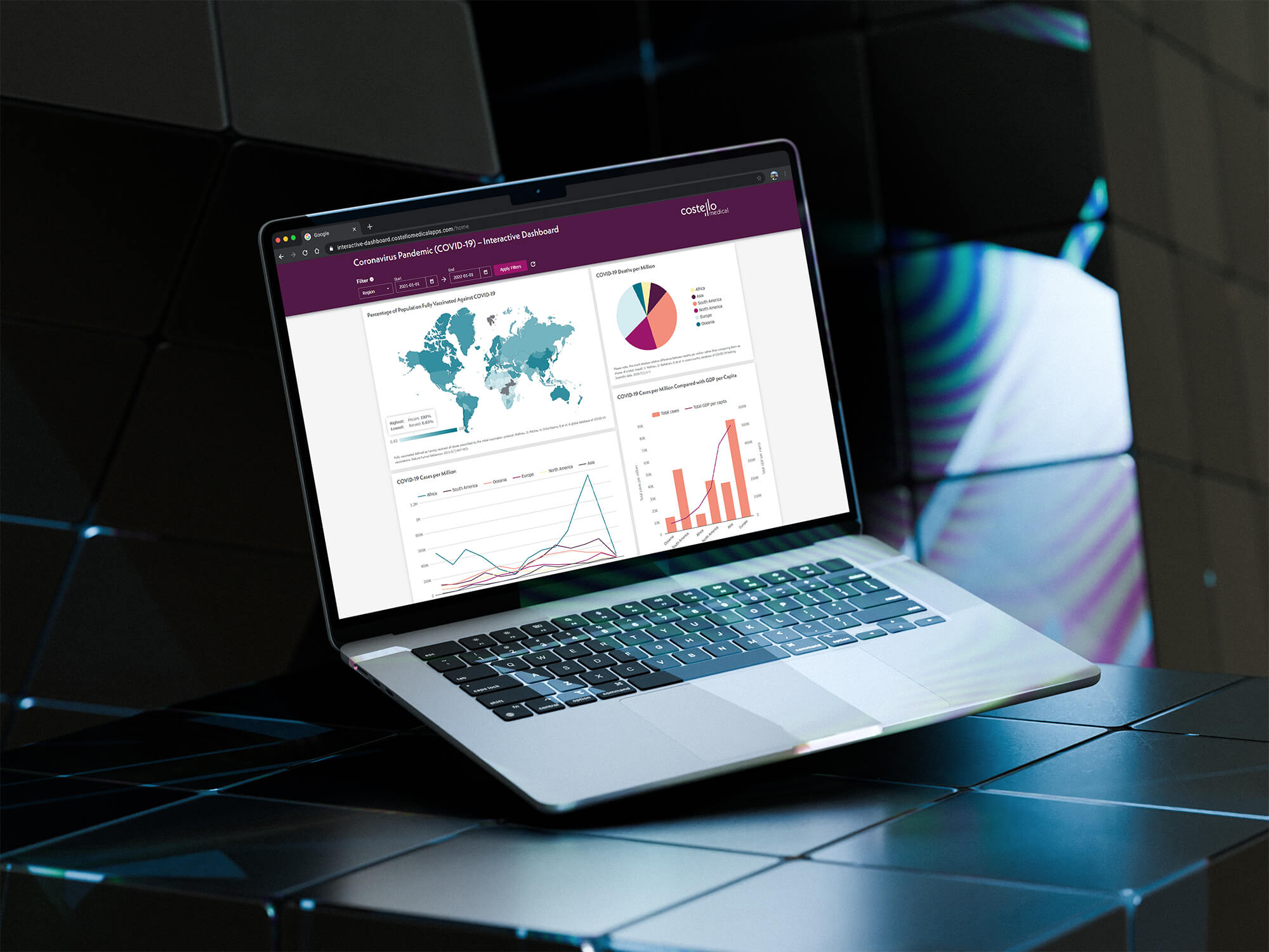
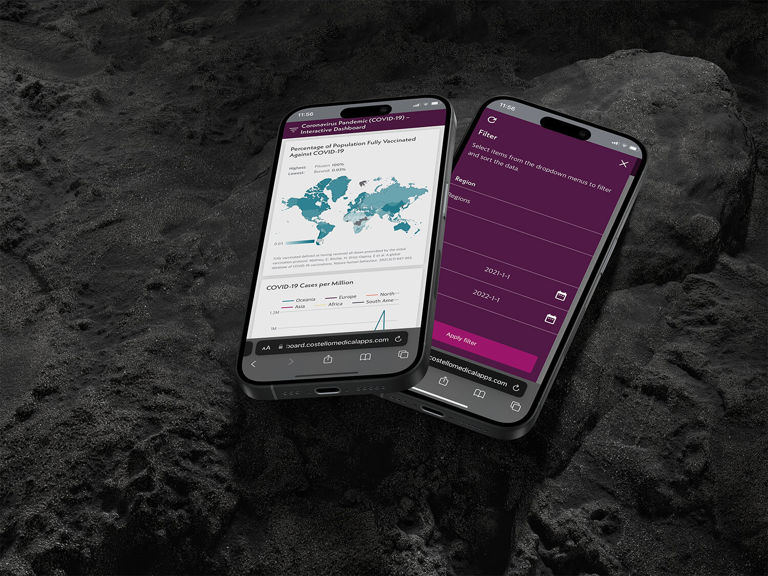
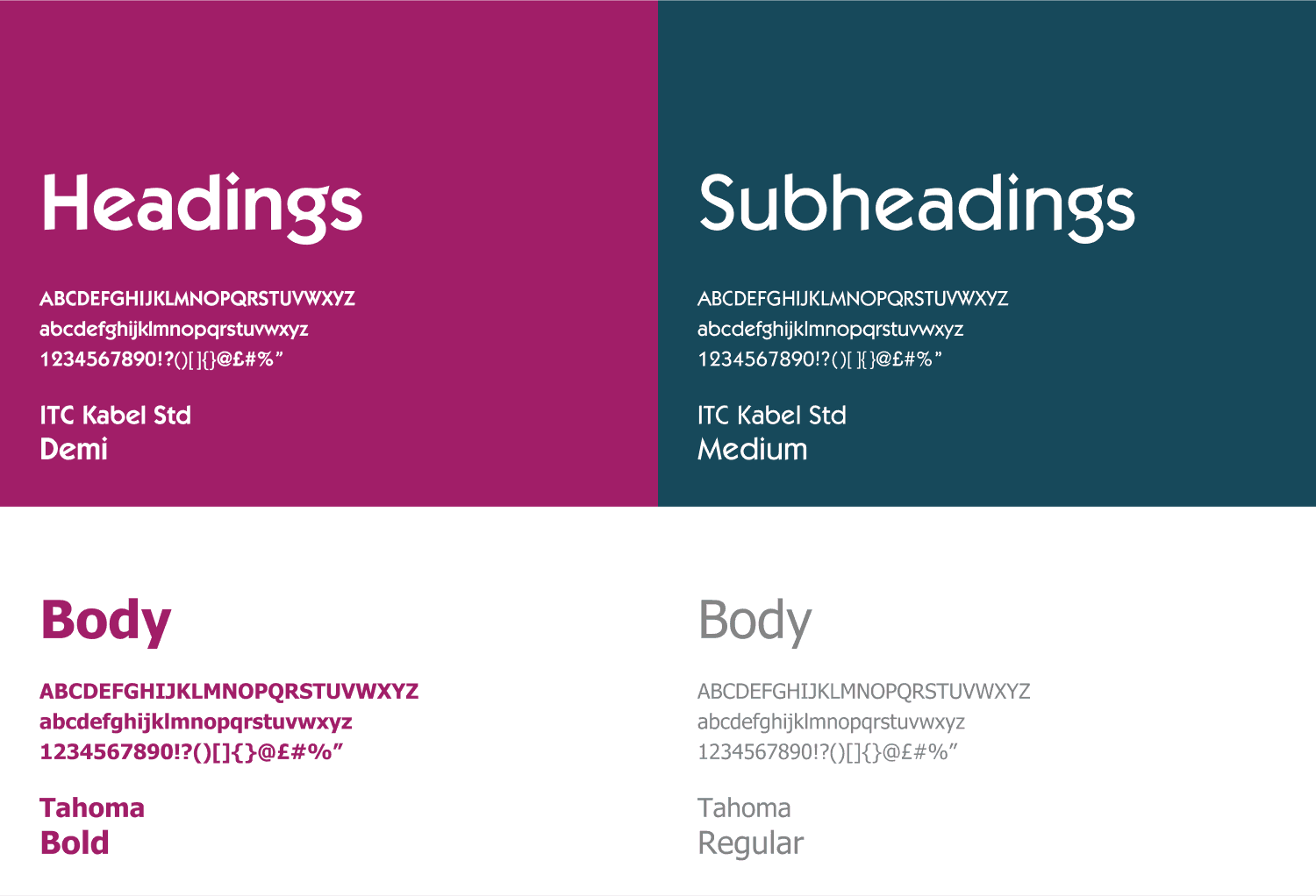
Dashboards
Data Visualisation
Due to short project timeframe, we decided to use traditional, simplified data visualisation methods for the showcase template. Data visualisation styles can be enhanced and tuned to match the specific needs of the client and data set.
Data visualisation research was conducted to provide and show clients what solutions were possible and could be implemented for their data set.
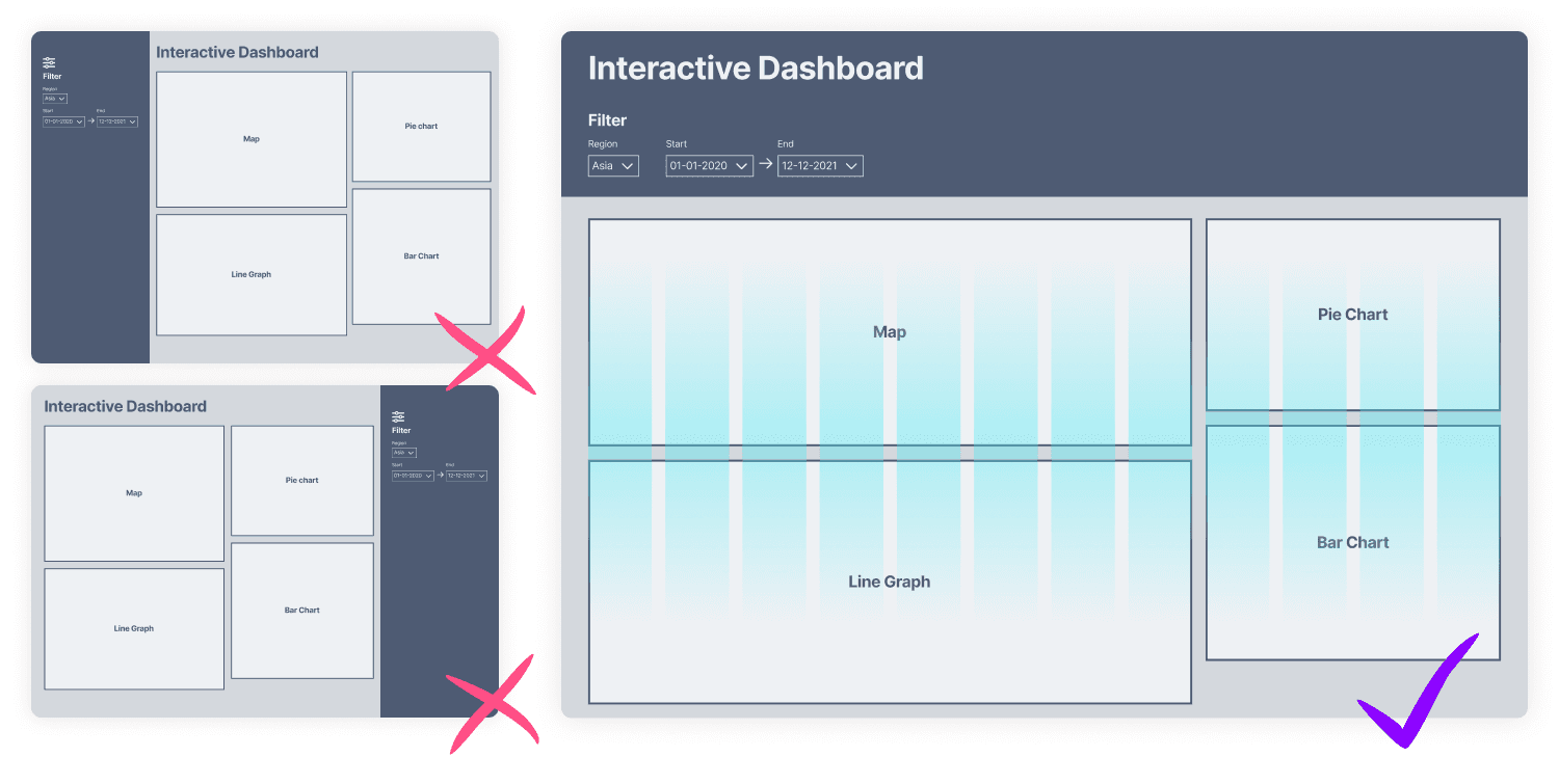
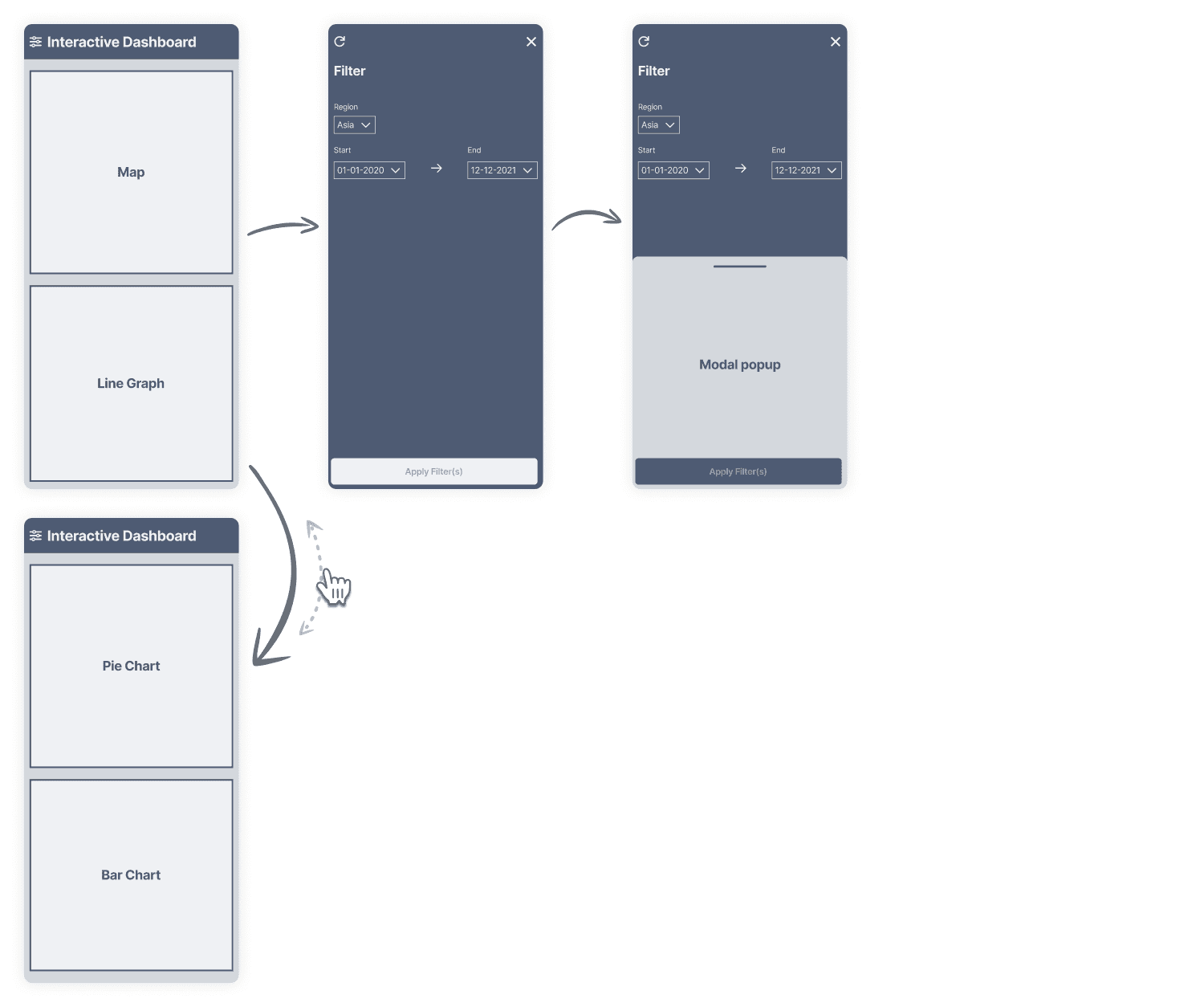
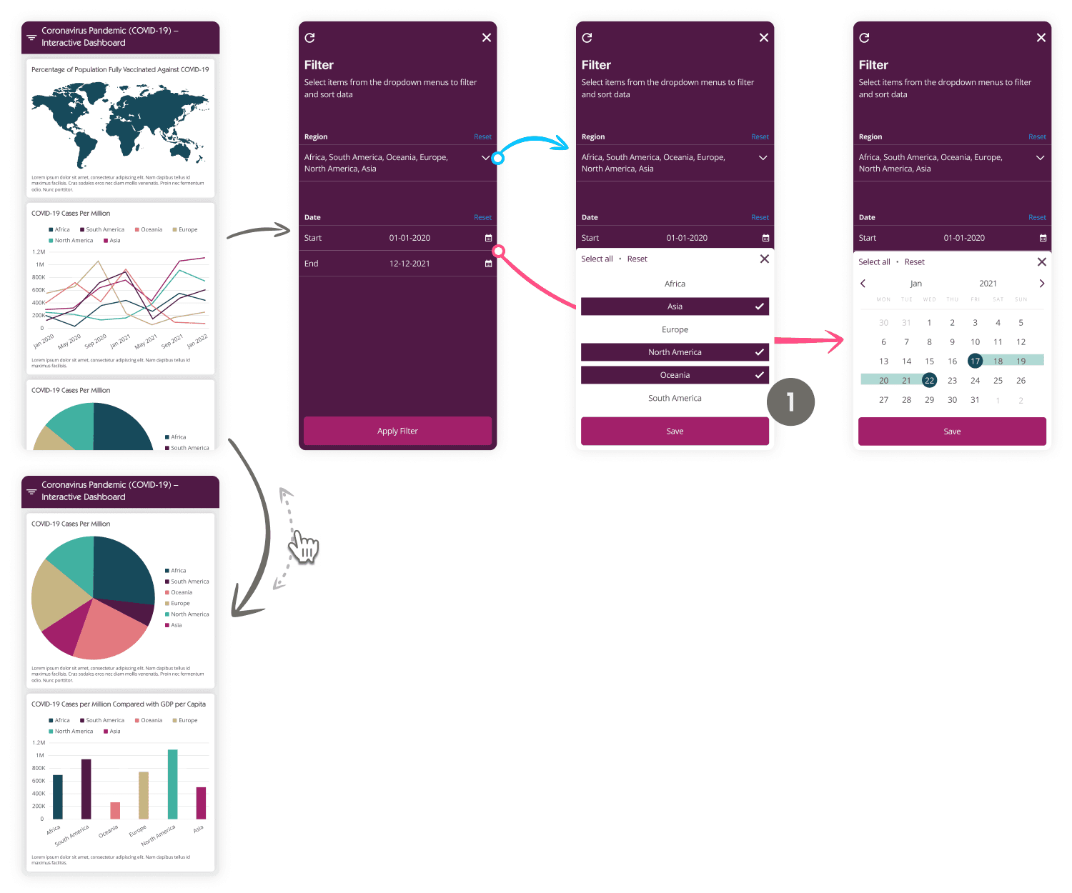
As the developers would be utilising Bootstrap CSS framework, I designed accordingly setting the number of columns to 12. To allow for larger data visualisation methods, such as the world map, I split the page up into two, 8x4 column (2:1) method offer ample space and aid visual hierarchy of the page.
Data perception
At the time of design, we had not confirmed the data set to be used. With this in mind, I designed each block to independently adjust their height dynamically to fit content. This would ensure blocks wouldn’t stretch, which may alter how data is perceived.
1
90% right handed, 10% left handed
(de Kovel, Carrión-Castillo and Francks, 2019)
Where possible, buttons were widened to the page width to accommodate for all users. However, icons were positioned right side to favour the larger proportion of right handers.
A/B testing hamburger placement
With 90% of people being right handed, this would have been an excellent opportunity to perform an A/B test on the product. To experiment whether the hamburger should be moved to the unorthodox, right side of the navigation bar. Due to project limits we did not perform an A/B test.
Dark-grey
#4D4D4F
Link
#2196F3