A self-initiated project aiming to improve and refine Zara’s homepage user experience. With a focus on maintaining Zara’s unique house style and the website's minimalist and visual atmosphere.
Team structure
Solo
Research method
User persona, user journey, usability testing, accessibility testing
Discipline
UX design, UI design
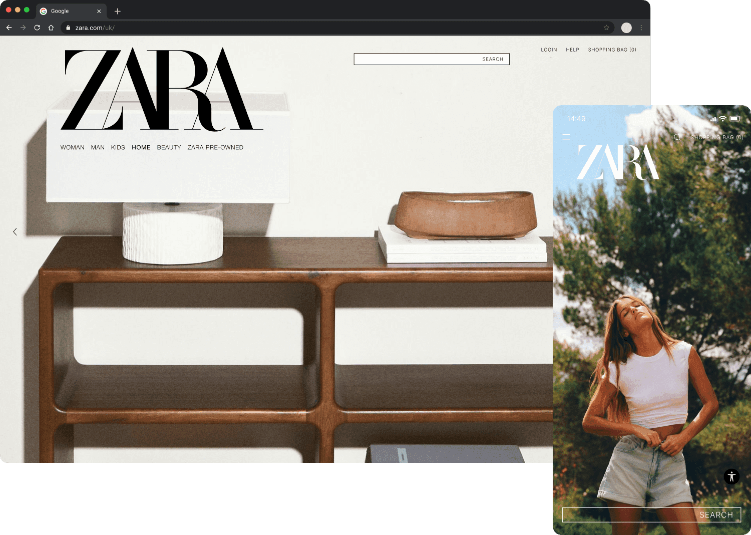
Platform
Desktop and Mobile
Duration
3 days
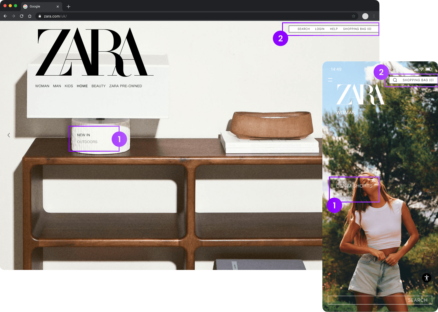
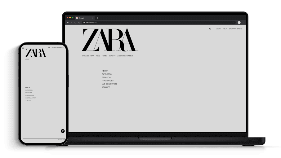
1
Section menu, informing current section (NEW IN), and subsequent sections (OUTDOORS)
2
Combined "SEARCH" and top right hand navigation bar

User journey key takeaways
Thoughts & painpoints
Accessibility
Multiple failed accessibility checks on text. Navigation bars were often not legible due to a lack of contrast with the background image.
Learning required
The unorthodox page navigation takes some getting used too, and isn't totally clear how to traverse initially.
Opportunities for improvement
1
Improve text readability to pass accessibility standards
2
Better communicate which section the user is currently viewing
3
Enhance hero navigation to encourage more exploration on homepage
Design
Wireframes
To reduce visual distractions and focus on functionality, I stripped the design back to a wireframe state. Whilst preserving the horizontal and vertical carousel style navigation, I searched for inspiration among websites and other platforms that use full-screen imagery. I found inspiration in video games and started to prototype a floating menu.
Wireframe 1
Wireframe 2
Prototype


Adopting an iterative design process allowed me to effectively analyse and refine the prototype. By evaluating each wireframe against user pain points, opportunities for improvement, and the initial brief, I was able to implement meaningful changes without compromising Zara’s distinctive navigation or minimalistic atmosphere.
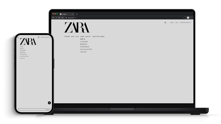
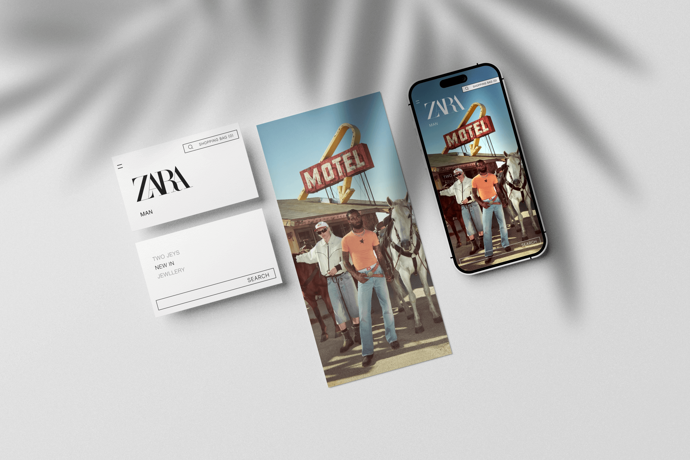
During the implementation stages, I focused on improving accessibility. Combining the search bar and secondary navigation made sense because:
Improves consistency between platforms, items are grouped on mobile
Fixed accessibility issues as the container inherits the search bars white background
Groups secondary actions and aligns items vertically

Final proposal broken down into components.